


Free Spirited and Timeless: My Favorite Boho Fonts for Branding - Part One
Explore the best boho and vintage fonts for branding—handpicked for creative businesses that want to stand out with warmth, artistry, and personality.

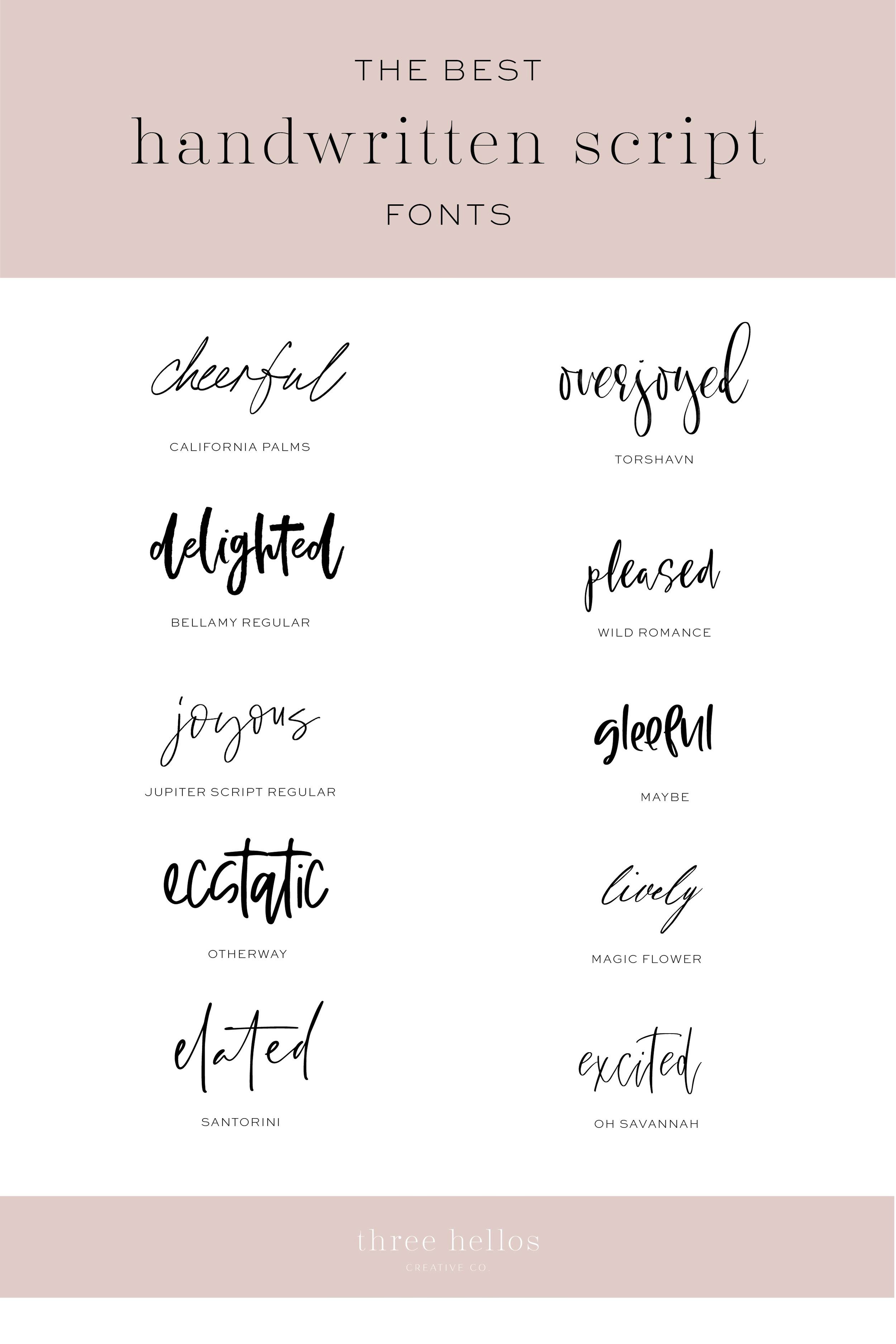

Fonts You Might Love: The Serif Edition — Part Three
Explore elegant serif fonts for modern branding and design. The Serif Edition — Part Three features ten refined typefaces perfect for creatives, studios, and boutique brands seeking balance and sophistication.


Slate & Sand: A Palette of Calm Confidence
If you’re drawn to color stories that feel composed, grounded, and quietly elevated, this one’s for you. Slate & Sand blends soft, organic warmth with cool modern structure — a balance that feels as intentional as it looks.

Blush & Bronze: A Balanced Palette of Warmth and Depth
Blush & Bronze blends soft peach, misty blue, and burnished bronze for a palette that feels balanced, elegant, and emotionally calm. These hues symbolize warmth, trust, and quiet sophistication — perfect for brands or interiors that want to feel refined yet approachable.

Soft Clay & Linen: A Warm Neutral Color Palette for Calm, Grounded Design
If you’ve been craving a color palette that feels equal parts cozy and elevated, this one’s for you. Soft Clay & Linen is a warm neutral color story that blends earthy beiges, honeyed undertones, and subtle sage for a look that’s timeless, grounded, and effortlessly sophisticated.

Creative, Grounded & Confident: A Color Palette for Modern Brands
When it comes to branding, your color palette isn’t just decoration — it’s one of the strongest ways to communicate who you are and what your business stands for. The right blend of colors can instantly convey trust, creativity, or sophistication. This palette, Creative, Grounded & Confident, brings together warmth, energy, and balance to help modern brands stand out.


Graceful, Grounded and Calm: A Color Palette for Elegant Brands & Interiors
Color has the power to shape how we feel, how we connect, and how we experience the world around us. This curated palette blends earthy tones and soft neutrals that work beautifully in branding, interiors, and even weddings. Each shade carries a meaning rooted in color psychology, making this collection as symbolic as it is stylish.


Balanced, Timeless & Warm: A Color Palette for Timeless Brands & Interiors
This collection is all about balance. The earthy browns and taupes ground the palette, the blues bring serenity and trust, while the terracotta and cream add warmth and light. Together, they create a refined harmony that feels timeless, versatile, and deeply calming.


Rich, Grounded & Warm: A Color Palette for Sophisticated Brands
Color has the power to shape how your audience feels about your brand before they ever read a word. Some palettes whisper with softness, while others bring depth, confidence, and richness.
This palette is all about grounded strength and approachable sophistication. With earthy tones, warm pinks, and deep burgundy, it creates a brand presence that feels steady, warm, and timeless — perfect for creatives, lifestyle brands, and businesses that want to balance trust and personality.