Graceful, Grounded and Calm: A Color Palette for Elegant Brands & Interiors
Color has the power to shape how we feel, how we connect, and how we experience the world around us. This curated palette blends earthy tones and soft neutrals that work beautifully in branding, interiors, and even weddings. Each shade carries a meaning rooted in color psychology, making this collection as symbolic as it is stylish.
The Palette at a Glance
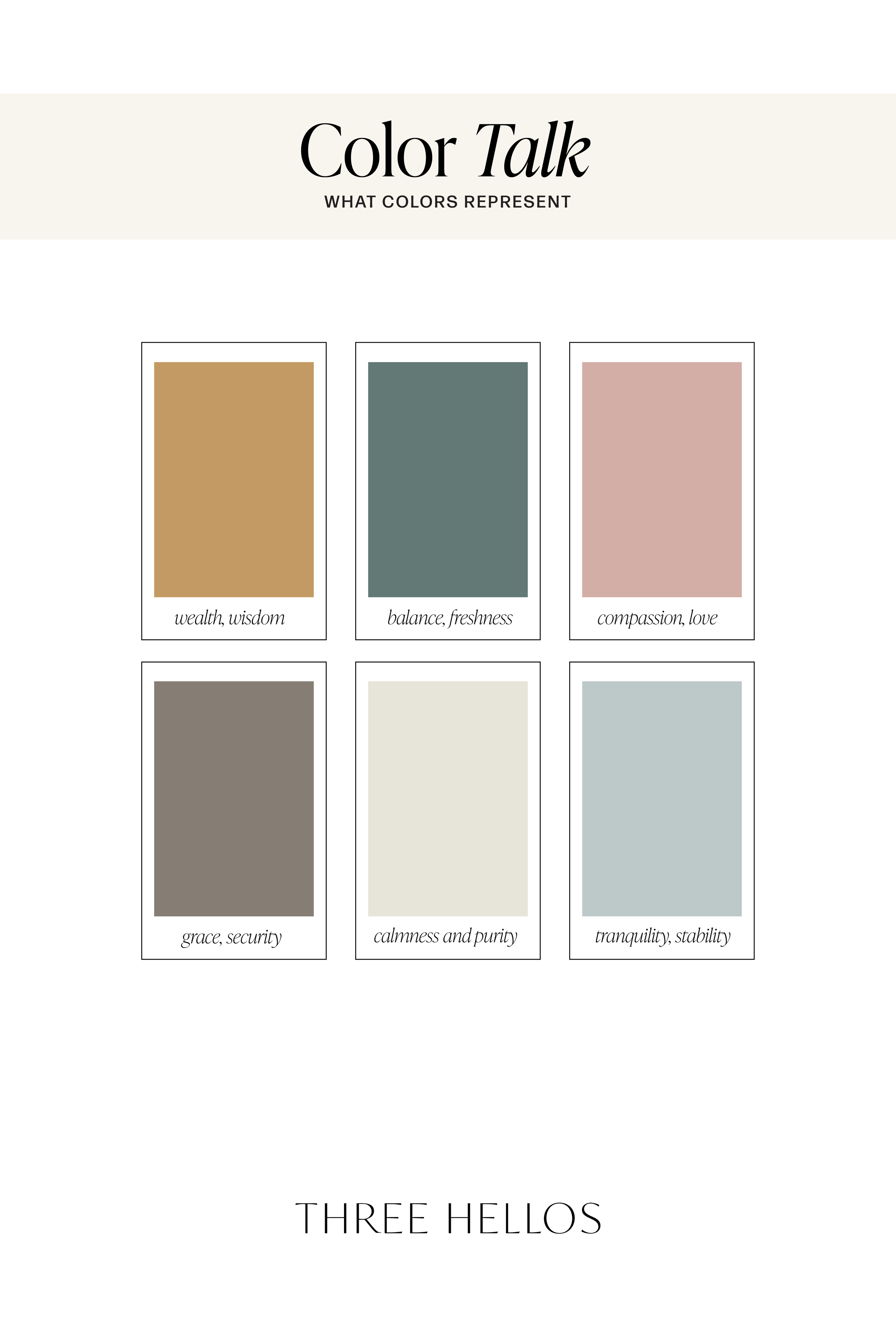
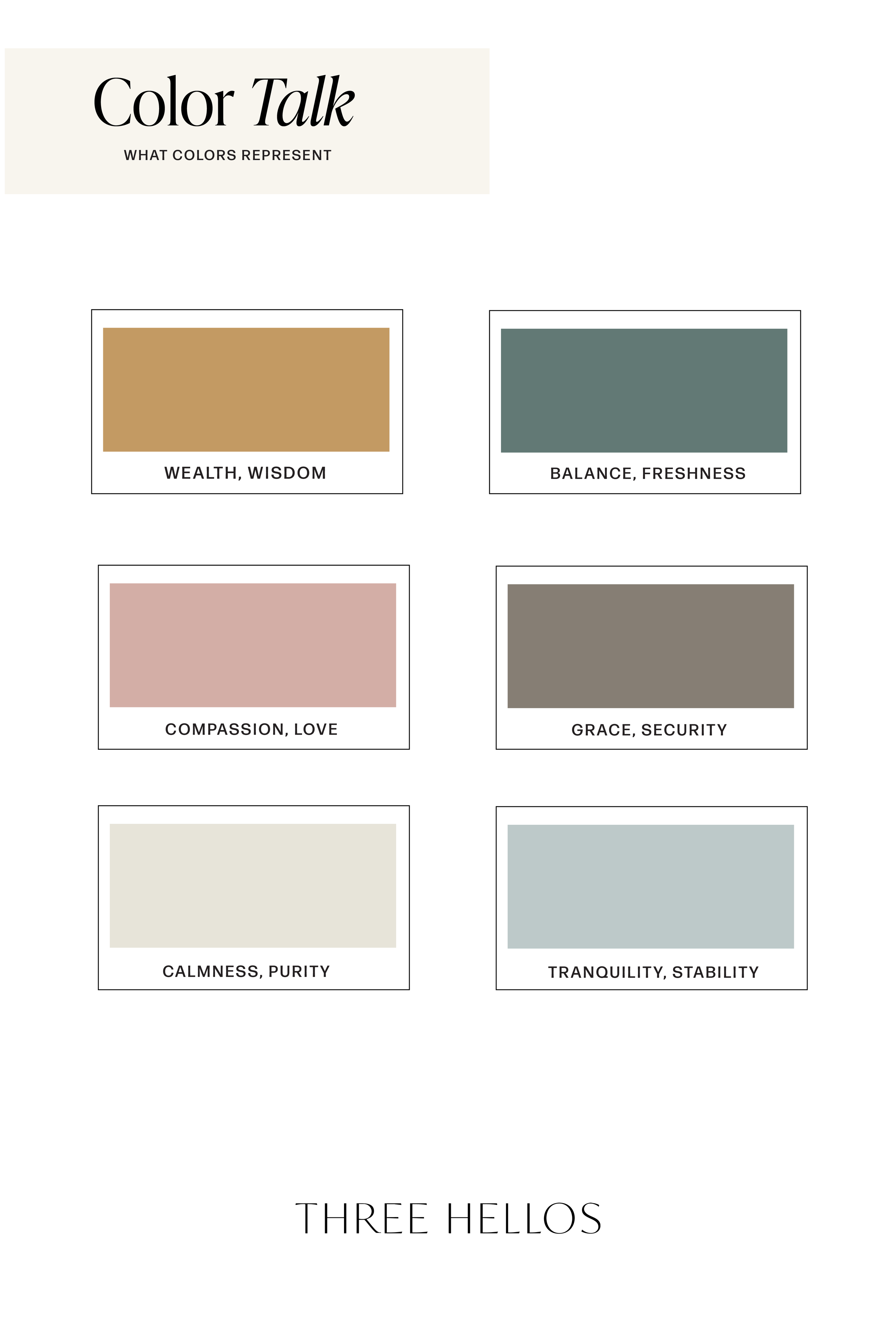
Warm Gold – Wealth & Wisdom
Golden ochre tones instantly bring warmth and a sense of richness. They symbolize prosperity, experience, and timeless wisdom, making them a strong anchor color for any brand or design.Deep Teal – Balance & Freshness
Teal is the color of balance and renewal. Its blend of blue and green makes it both calming and revitalizing — perfect for creating a sense of harmony and sophistication.Dusty Rose – Compassion & Love
Muted pinks add softness and emotion. They represent compassion, kindness, and romantic love, offering a welcoming touch in any palette.Taupe Gray – Grace & Security
Neutral and grounded, taupe conveys reliability and strength while still feeling graceful. It’s an understated shade that helps balance out stronger colors.Soft Cream – Calmness & Purity
Cream tones bring clarity and a sense of calm. They symbolize simplicity and purity, making them a versatile base shade that works across branding and interiors.Muted Blue-Gray – Tranquility & Stability
Blue is universally associated with peace and trust. Paired with gray, it adds stability and quiet strength — an ideal color for creating serene, dependable designs.
How to Use This Palette
Branding → Perfect for businesses that want to feel approachable yet refined. Wellness brands, lifestyle blogs, or creative studios could lean into these tones for a calm, trustworthy identity.
Interiors → These colors translate beautifully into home design. Picture golden accents with dusty rose textiles, paired with muted blues for a tranquil, modern space.
Weddings → A romantic yet timeless scheme. Cream and dusty rose for florals, taupe-gray for grounding, and golden accents for a touch of elegance.
Why This Palette Works
This collection blends warmth, balance, and calm. It’s soft but not bland, refined but not cold. The earthy foundation makes it versatile, while the muted tones add a touch of modern sophistication.
Whether you’re designing a brand, styling your home, or planning a wedding, these colors will bring a sense of harmony and timelessness to your vision.
Inspired by this palette? Pin it for later and explore more color psychology insights over on Pinterest @ThreeHellos
Color Codes
Left to Right:
#C39A63 / #090707 / #627975 / #D3AEA6
#867E74/ #E7E4D8/ #BDC9C9


