Blush & Bronze: A Balanced Palette of Warmth and Depth
If you’ve been drawn to color stories that feel both warm and composed, this one’s for you. Blush & Bronze is an elegant fusion of soft peach tones and cool, misty blues — grounded by a deep bronze accent that adds richness and depth.
This palette tells a story of balance: warm human energy meets grounded calm. It’s the kind of color story that feels emotional yet collected — perfect for brands or spaces that want to feel refined, welcoming, and quietly confident.
The Psychology Behind the Palette
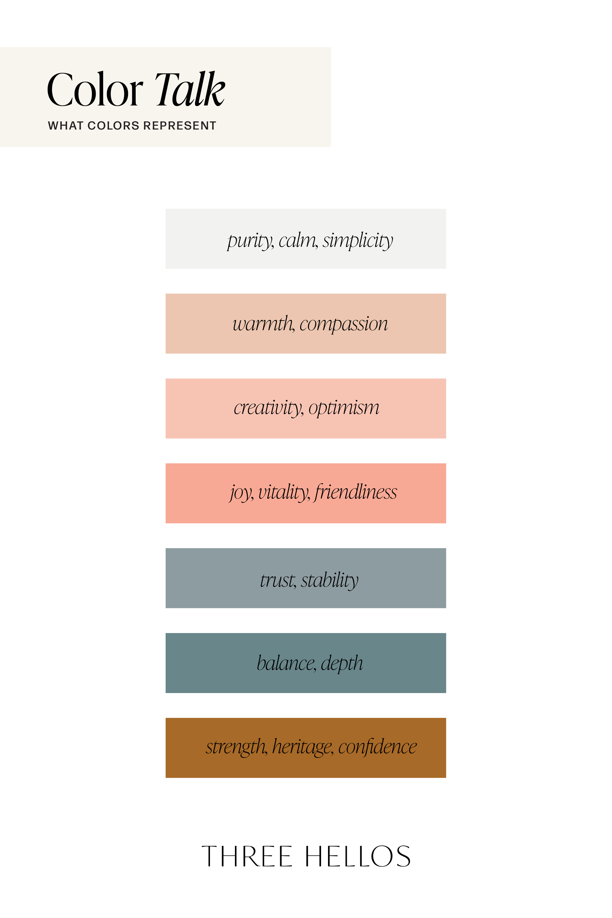
Each hue in this palette carries its own quiet message. The blush and apricot tones evoke warmth, kindness, and approachability — they make a brand feel human. The dusty blues and teals introduce a layer of trust, calm, and professionalism, while the burnished bronze grounds everything in strength and timelessness.
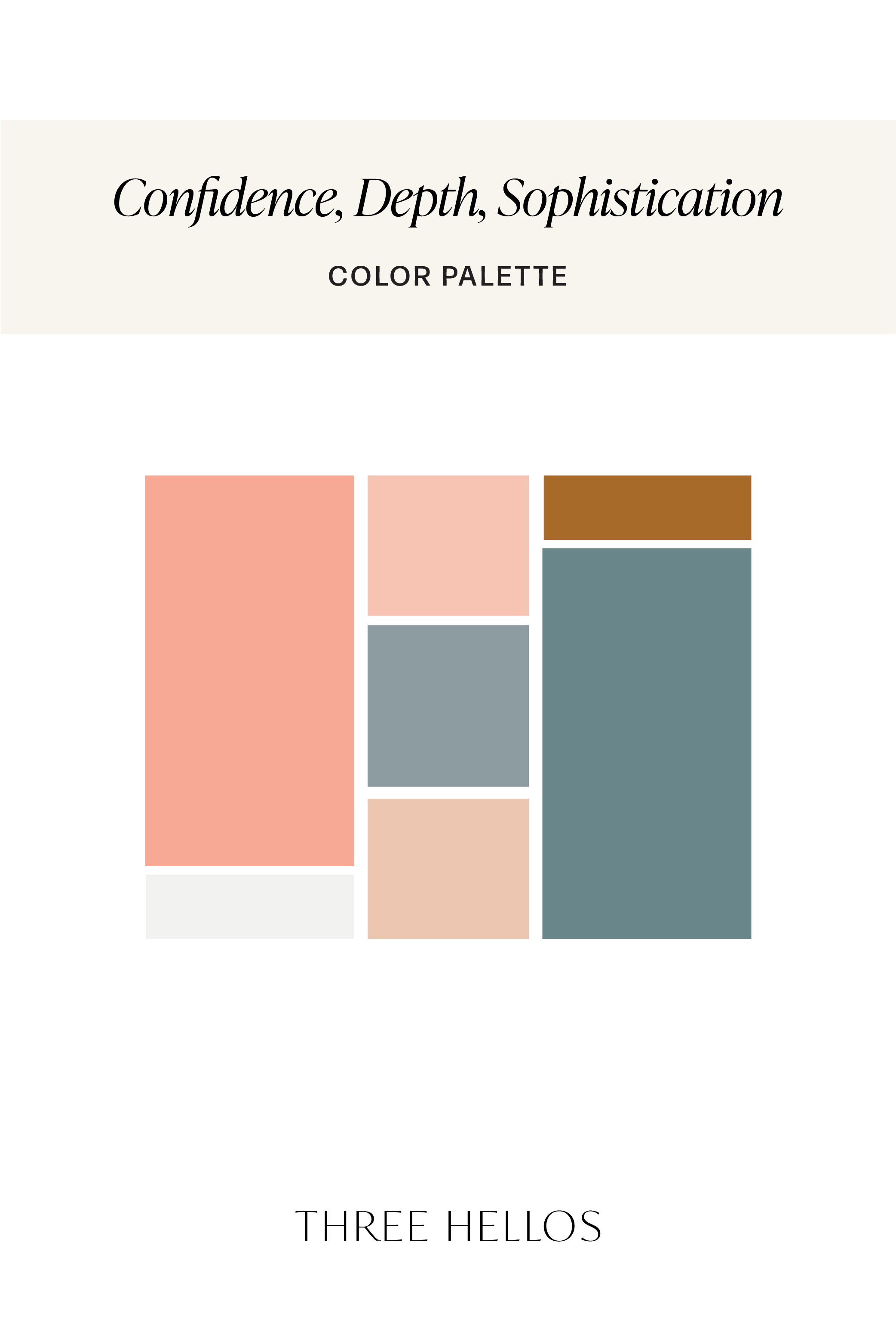
Together, they strike the ideal balance between creativity and composure, warmth and sophistication. This combination can instantly make a brand or space feel more intentional, emotional, and rooted.
Where to Use This Palette
This palette works beautifully for designers and creatives who want a warm-meets-cool harmony that feels timeless yet expressive.
Branding: Ideal for boutique studios, wellness brands, or creative entrepreneurs wanting a trustworthy yet approachable tone.
Web Design: The neutral base and blush tones pair perfectly with modern typography and soft photography.
Interiors: Create serene yet lived-in spaces with layers of linen, wood, and muted metals.
Social Media: Offers versatility — airy backgrounds with pops of warmth that photograph beautifully.
The Feel
Psychology keywords:
Warmth, Trust, Balance, Sophistication, Emotional Calm
This palette feels elevated and intentional — never loud, but always memorable. It’s the quiet confidence of a sunrise on a coastal morning: grounded, glowing, and endlessly balanced.
Color Breakdown
Soft White-Gray (#F2F1F1) – Calm and neutral foundation
Muted Peach (#ECC6B0) – Soft warmth and compassion
Blush Coral (#F7C4B4) – Optimism and creativity
Apricot (#F8A995) – Friendly and uplifting energy
Misty Blue-Gray (#8D9CA1) – Stability and reflection
Dusty Teal (#69868A) – Tranquility and depth
Burnished Bronze (#A86A28) – Strength and confidence
Inspiration
Think of soft linen sheets paired with aged brass, morning light on terracotta, or the quiet mix of ocean spray and sun-warmed skin. Blush & Bronze embodies that feeling — human, natural, and deeply balanced.