Fonts You Might Love: Serif Edition Part Two
If you caught my first roundup of favorite serif fonts for branding, you already know I couldn’t possibly fit them all into one post. Consider this the second installment of my go-to serif fonts — and honestly, these are just as good as the first set. In fact, a few of these are some of my recent favorites that I keep reaching for in brand projects.
And if you missed my first post, catch up on that here!
Why Serif Fonts Work So Well in Branding
Serif fonts have small structural details (often called flourishes) at the ends of their strokes. These details give serif fonts a more classic and traditional feel, while sans serif fonts (literally meaning “without serif”) tend to feel modern and minimal.
The choice between serif and sans serif is more than just style preference — it’s about communicating the right message. Serif fonts are fantastic when you want your brand to feel timeless, elegant, trustworthy, or editorial.
The Fonts
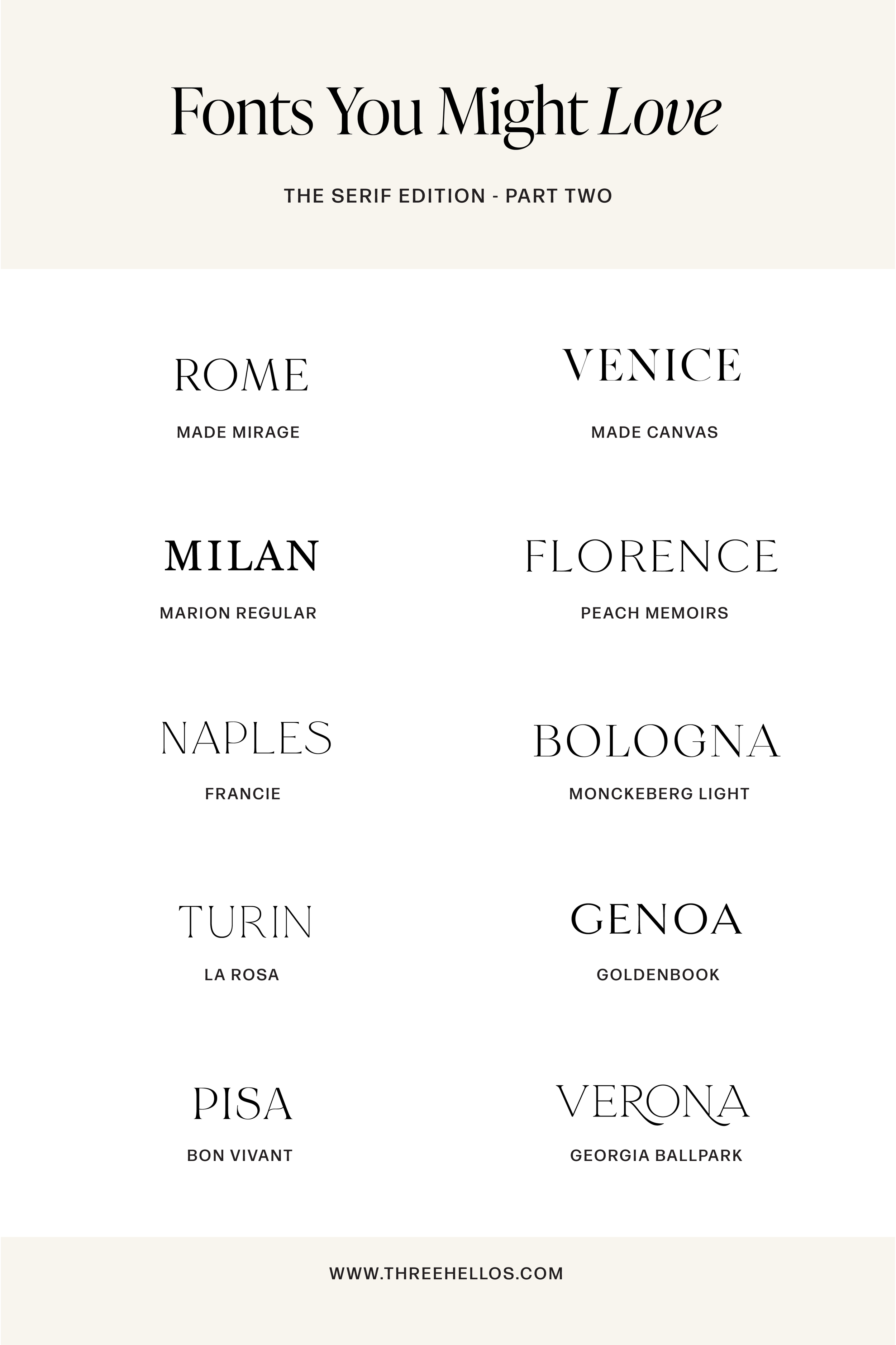
Here are 10 serif fonts I love for creating polished, elevated brand identities:
Made Mirage (Rome)
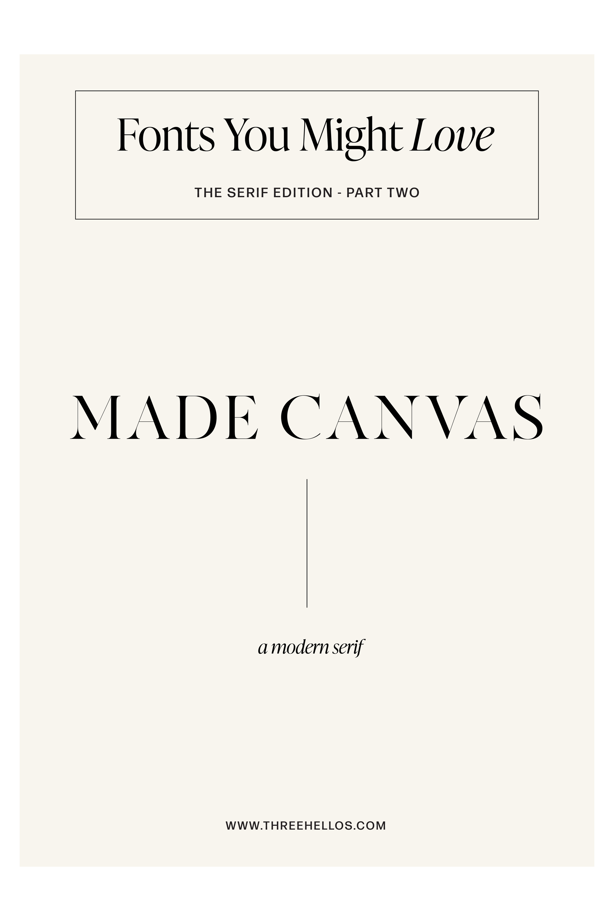
Made Canvas (Venice)
Marion Regular (Milan)
Peach Memoirs (Florence)
Francie (Naples)
Monckeberg Light (Bologna)
La Rosa (Turin)
Goldenbook (Genoa)
Bon Vivant (Pisa)
Georgia Ball Park (Verona)
GRAB THE FONTS HERE:
MADE MIRAGE / MADE CANVAS / MARION / PEACH MEMOIRS / FRANCIE / MONCKEBERG / LA ROSA / GOLDENBOOK / BON VIVANT / GEORGIA BALL PARK
Pro Tip from a Designer
I always recommend taking a test drive of a font before purchasing. Type out full words, headlines, or even the alphabet to see how every letterform looks. Tiny details — the shape of a “g” or the curve of an “r” — can make or break the way a font feels in your branding. I can’t tell you how many times I’ve fallen for a font, only to be turned off once I saw a single awkward letterform.
Fonts are emotional. They set the tone, create a first impression, and can literally attract (or repel) your ideal clients.
Final Thoughts
Choosing fonts isn’t just about picking something pretty. It’s about finding typography that aligns with your brand story, your core adjectives, and your audience’s expectations. When done right, your fonts become an extension of your brand voice.
And if you’re also curious about my favorite sans serif fonts, you’ll want to check out this post