Slate & Sand: A Palette of Calm Confidence
If you’re drawn to color stories that feel composed, grounded, and quietly elevated, this one’s for you. Slate & Sand blends soft, organic warmth with cool modern structure — a balance that feels as intentional as it looks.
It’s a palette that speaks softly but carries confidence. The cool undertones of slate and steel create calm and clarity, while the warmth of sandstone, sage, and blush beige brings connection and ease. Together, they form a story of balance — modern, human, and timeless.
The Psychology Behind the Palette
Every shade in this palette carries an emotion. The slate tones represent stability and trust — a sense of calm authority. The deeper charcoal adds depth and grounding, giving structure to the palette’s lighter notes.
Soft sandstone introduces warmth and approachability, the color equivalent of open conversation. Sage green brings renewal and mindfulness — a nod to nature and intentional living. The layered neutrals of ivory and blush beige create openness and balance, while the touch of silver-gray ties everything together with quiet sophistication.
Together, these hues form a visual language of trust, balance, and thoughtful design — perfect for brands or spaces that want to feel steady yet approachable.
Where to Use This Palette
This color story works beautifully for creatives and professionals who want a look that feels confident without ever feeling cold.
Branding: Ideal for interior designers, wellness brands, or boutique studios that want to evoke calm confidence and refinement.
Web Design: The soft neutrals and slate accents create structure and flow, letting content breathe while still feeling intentional.
Interiors: Layers beautifully with linen, brushed metal, and stone — creating spaces that feel lived-in, elegant, and endlessly grounded.
Social Media: The tonal contrast photographs beautifully — light, cohesive backgrounds with subtle depth and warmth.
The Feel
Psychology keywords:
Calm, Confidence, Balance, Refinement, Modern Ease
This palette feels elevated and intelligent — like soft conversation in a sunlit workspace or the quiet stillness of morning light on stone. It’s refined without pretense, approachable without losing polish — a modern neutral story that always feels timeless.
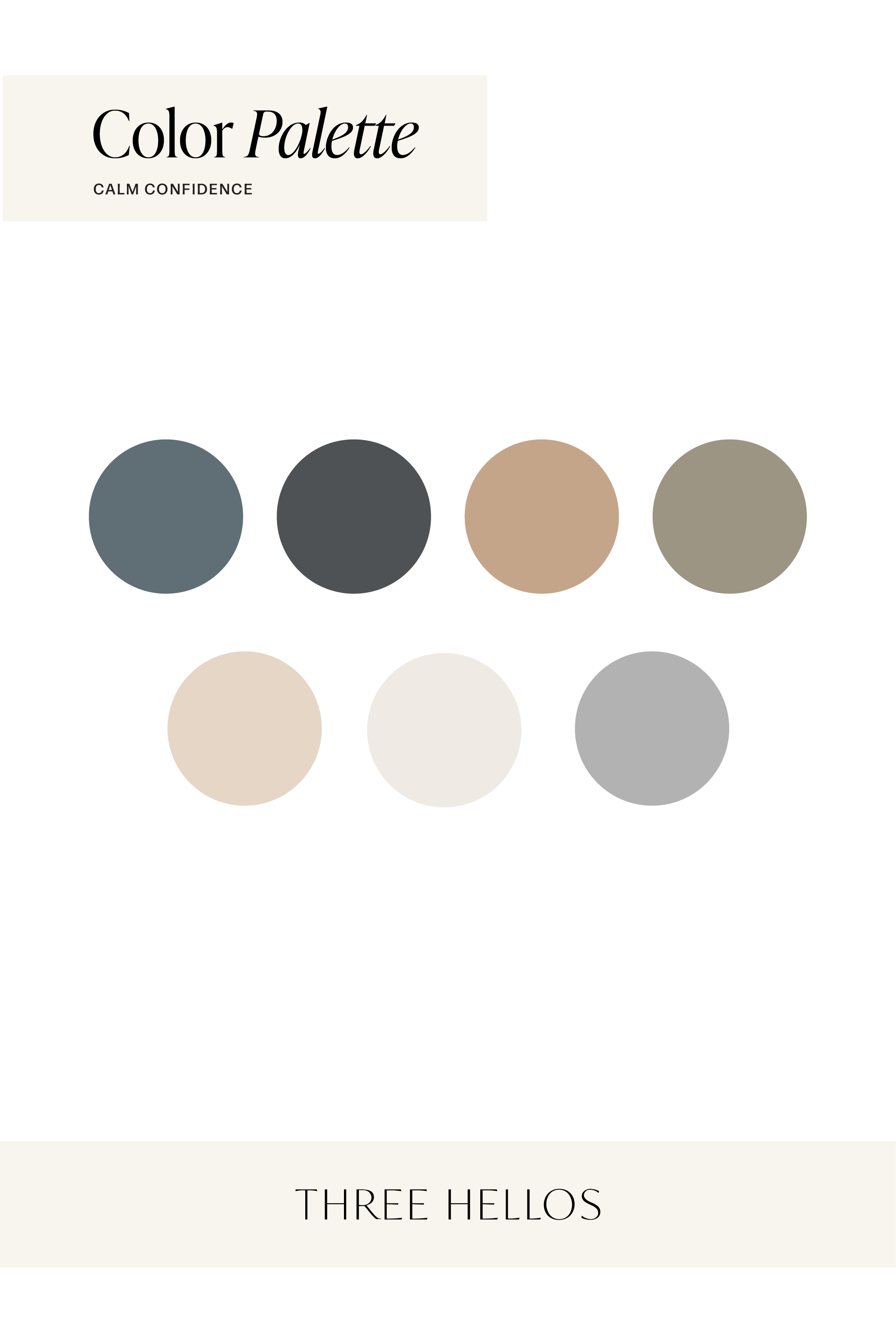
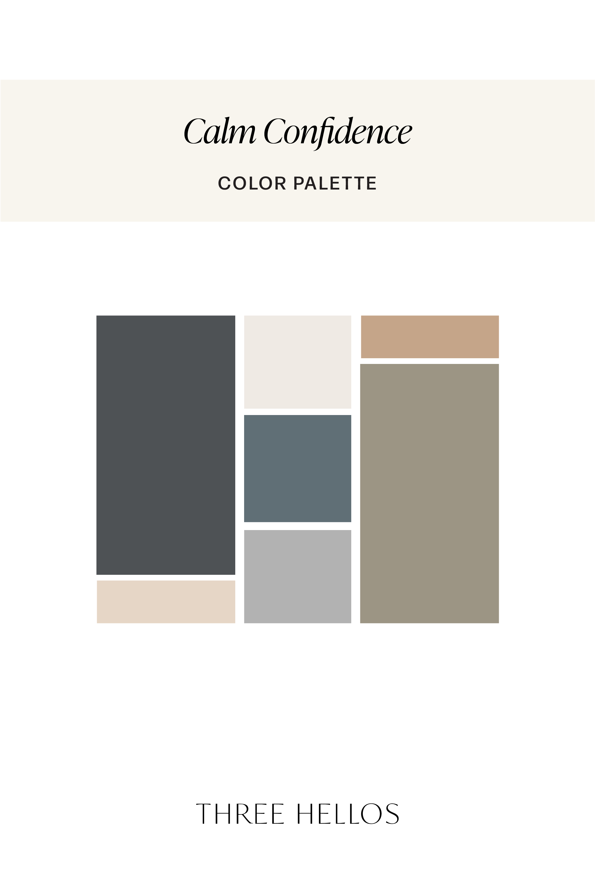
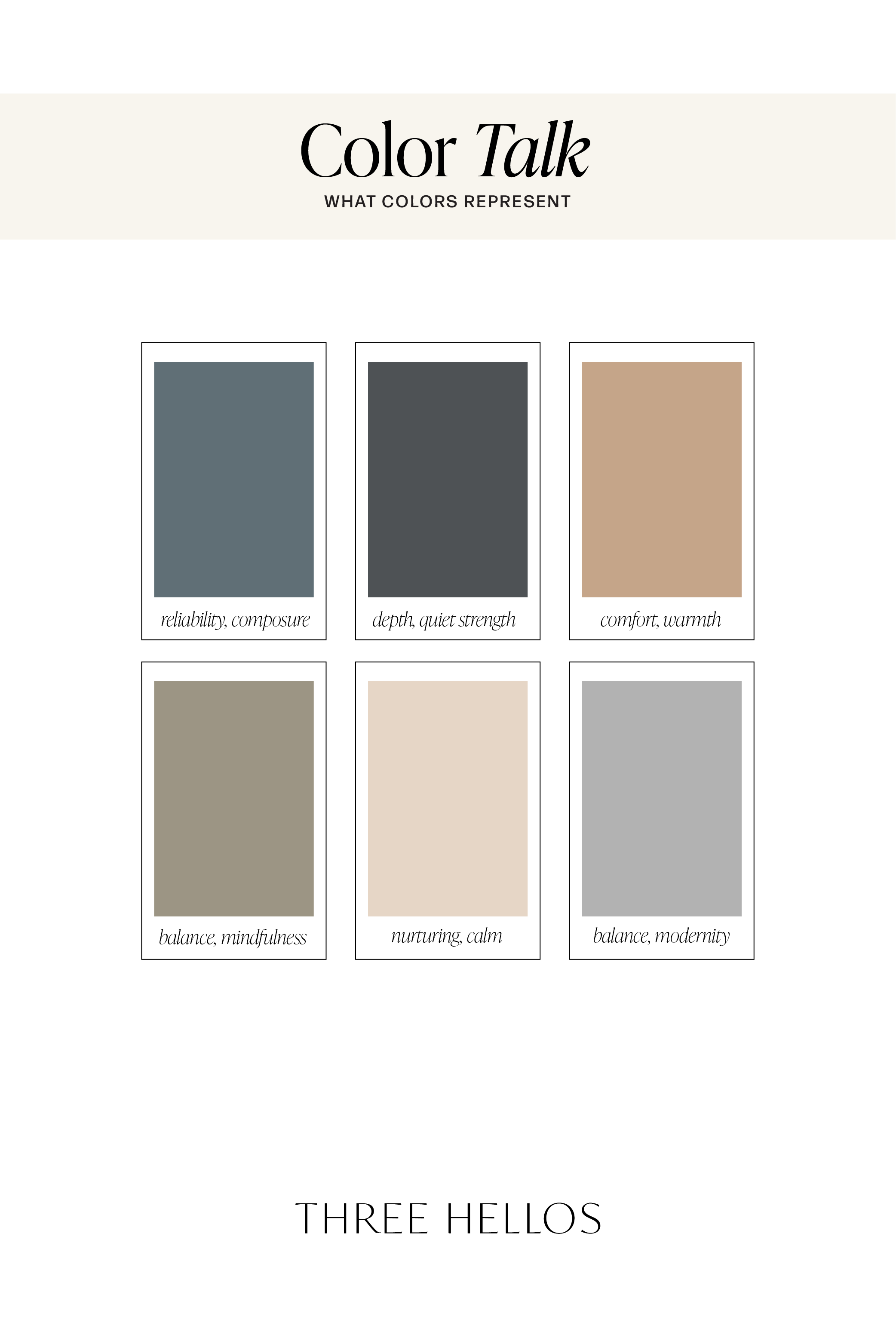
Color Breakdown
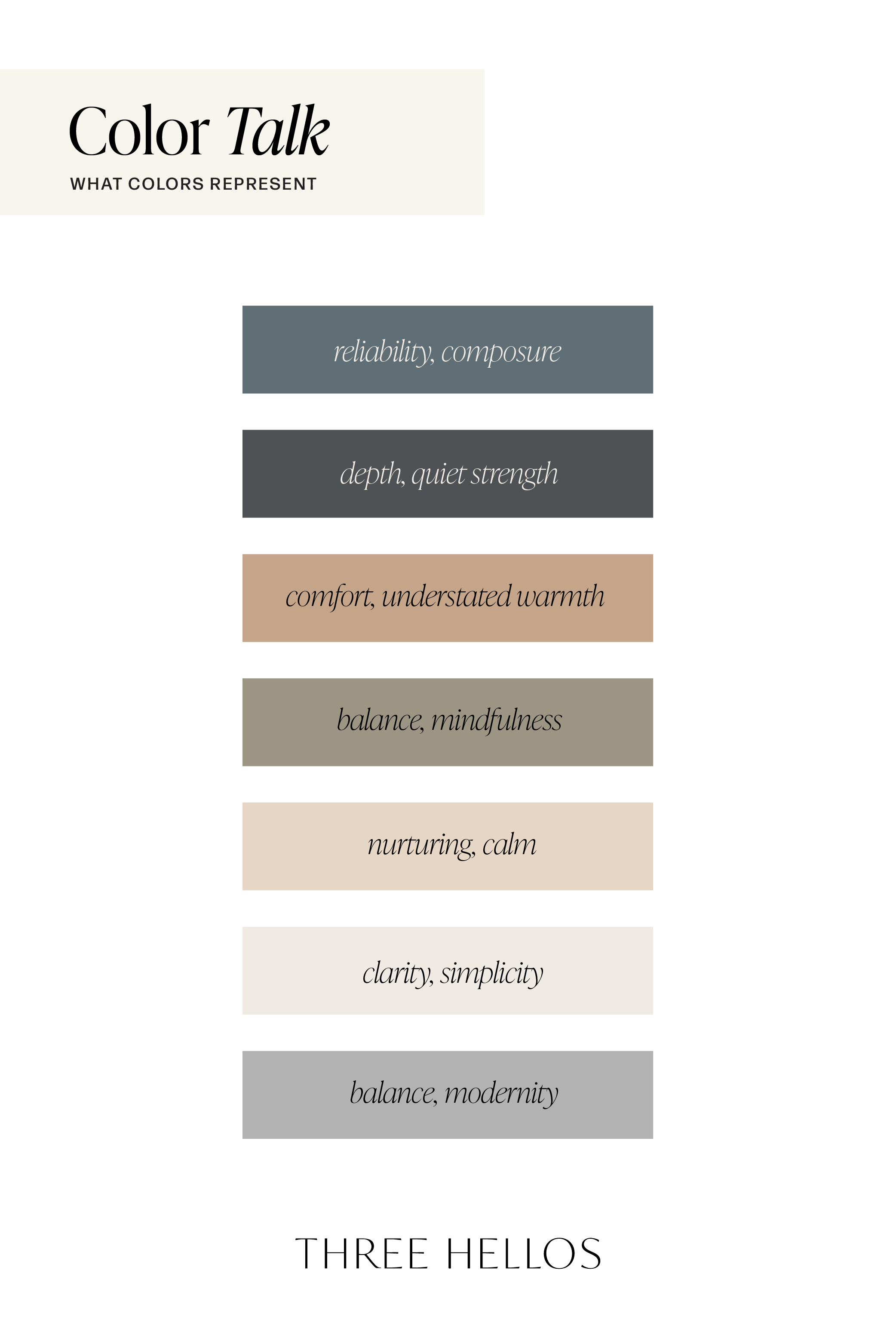
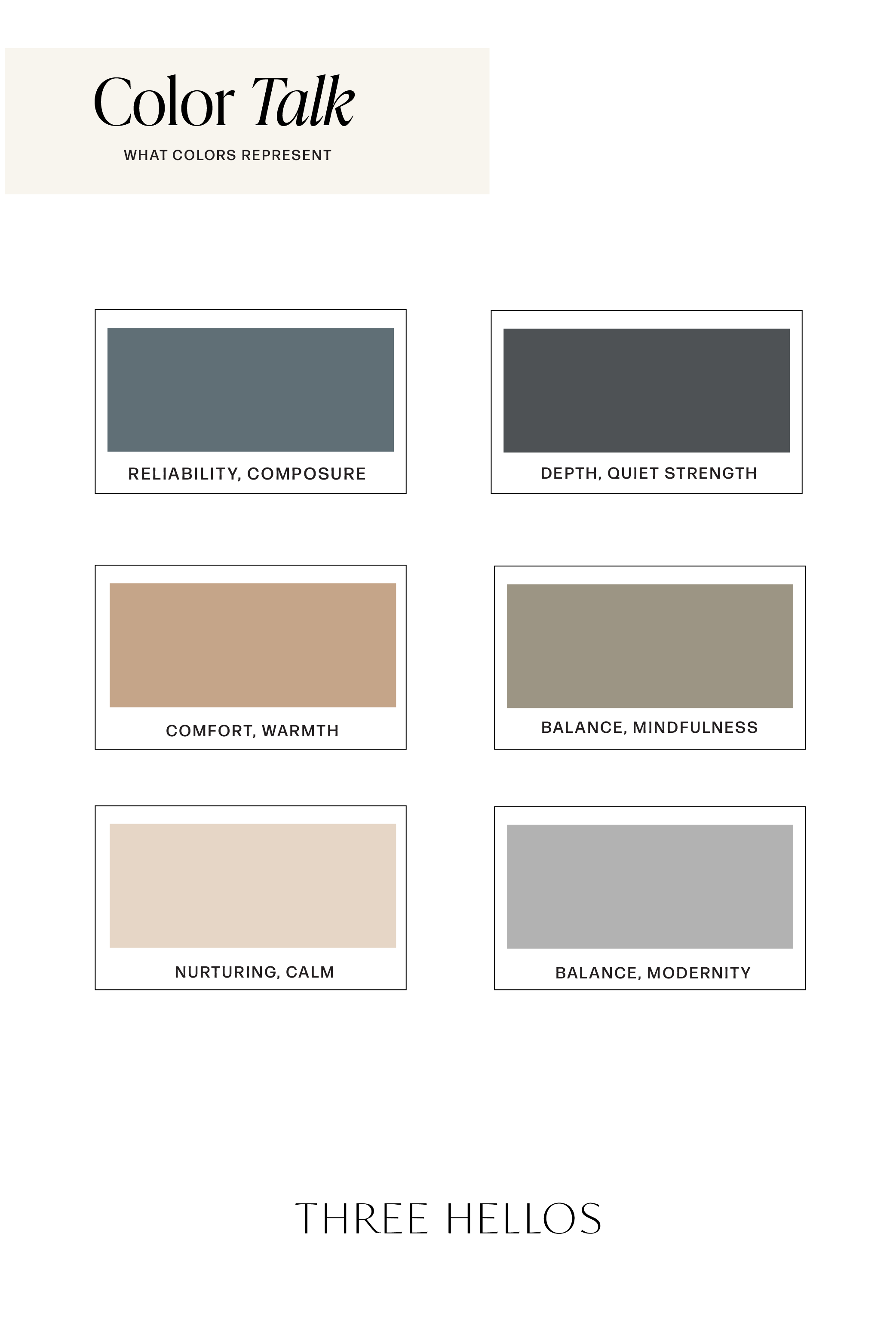
Slate Blue-Gray (#606F76) – Reliability and composure
Charcoal Steel (#4E5255) – Depth and quiet strength
Warm Sandstone (#C5A589) – Comfort and understated warmth
Soft Sage (#9C9584) – Balance and mindfulness
Blush Beige (#E6D6C6) – Nurturing calm
Ivory Linen (#EFEAE4) – Clarity and simplicity
Modern Silver (#B2B2B2) – Balance and modernity
Inspiration
Think of smooth concrete beside sun-warmed stone, soft linen layered with brushed silver, or a studio filled with natural light and quiet focus. Slate & Sand is that feeling — balanced, intentional, and beautifully composed.